https://disneycicerone.com/how-the-design-of-disney-parks-affects-our-perspective/ The layout of the Disney parks may not be something you think about except for at the end of the day when your feet are aching and sitting feels like the best ride ever. Or when you’re hiking around the Epcot World Showcase in the blazing sun and afternoon heat. But the ways the Imagineers have creatively designed the parks influence your experience more than you think, and in ways you might not have considered before.
So today we’re going to talk about why we love (or mostly love) Disney’s park designs and architectural illusions. And we’ll learn a bit about the history of Disney’s design along the way.
Let’s dive in, shall we?
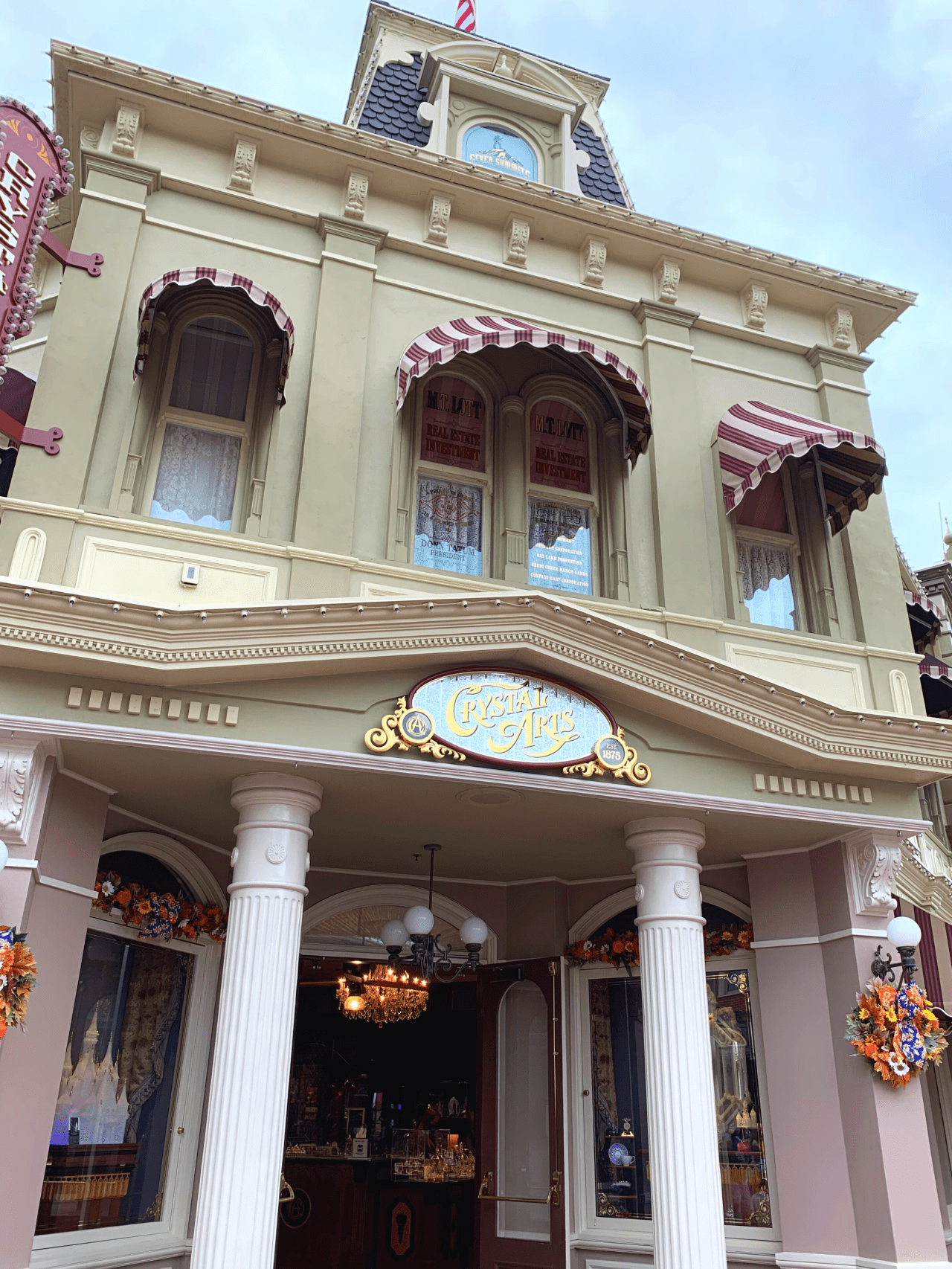
We all know Disney creates the impression of height using forced perspective (or at least you do now!). Almost all the buildings on Main Street USA are designed with a 1—5/8—1/2 scale. The first floor is full scale, followed by the next facade floor being 5/8 before adding a third fake floor that is only 1/2 size. This illusion draws the eyes up and makes you think (from the ground) that the building is three stories when it actually is quite shorter. (Note: Main Street USA in the Magic Kingdom in Florida uses a 7/8 scale instead because it has a larger castle and so everything is sized up instead of “pony size” like Walt wanted at Disneyland).
There are a few buildings on Main Street USA, however, that do not use forced perspective. One is Tony’s Town Square restaurant building, which needed to be tall enough to block the view of the Contemporary while in the parks and was therefore built with all its floors true-to-size.
Another is the Town Square Firehouse, which stands a full three stories because the original plans for the parks included an apartment for Walt’s family like its counterpart in Disneyland. As you may know, Walt sadly passed away before the opening of Walt Disney World, which made the apartment unnecessary. But as construction was already underway, the building was completed full-scale.
Forced perspective isn’t limited to the height of the buildings, however, on Main Street USA. The buildings themselves are designed to be at a slightly wider angle on one side of the building, so when you are traveling down the street towards the castle, it creates an illusion that the end of the street (and castle) is far away in the distance. When you turn around and head towards the exit after a long day, the street appears shorter and the end of the street manageably closer.
The trees also play a part in this visual trickery, as they are smaller as you look down the street towards the castle to make the magnificent structure appear larger and more impressive. The trees planted in the Town Square near the exit are larger and therefore create the illusion as you walk back to your resort that the train station is much closer.
And speaking of the walk back to your hotel room…
Walt had a term for the sore feet we often get after a long day of traipsing around the parks… he called it “museum feet”. His goal in designing the original parks was to avoid tired, aching feet as much as possible by creating useful walkways that connected people quickly to their destination.
After traveling to Washington D.C. and seeing the French-born architect Pierre L’Enfant’s hub-and-spoke street designs, Walt proposed the same concept for Disneyland (if you’ve ever traveled in Paris, you’ll notice this is a common architectural street layout there as well). Below is a 1:100 scale model of opening day in Disneyland, where you can see this concept played out:
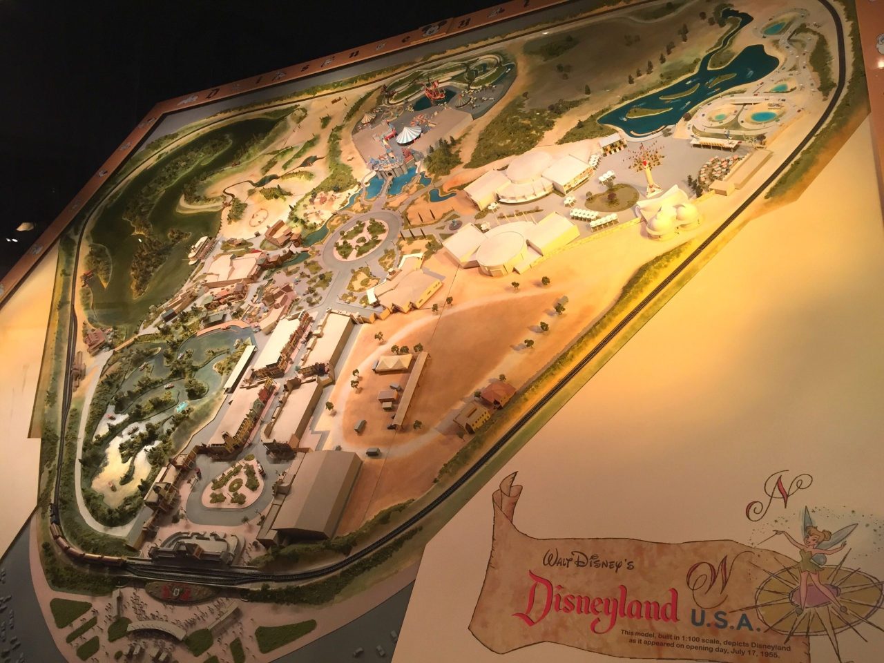
In this original design, every land is accessible via the hub in the center of the park. This hub, called “Central Plaza” or “Plaza” by Walt and the Imagineers (hence “The Plaza Inn” name) allowed for visitors to always have an anchor point to orient themselves to no matter where they were in the park. The castle itself became a visual reference for this anchor point.
But what Walt soon realized is that everyone had to backtrack back to the hub in order to get to another land, and that simply called for too much walking. So, secondary routes between each land were created at the back so that you could easily travel from land to land.
I am going to pause here and mention that, in my opinion, it is a major flaw in the design of the Magic Kingdom in Disney World that there is NOT a back entrance to Frontierland connecting it to Liberty Square/Fantasyland as there is in Disneyland. That walk from Big Thunder Mountain Railroad is ROUGH to backtrack around the Rivers of America on a hot Floridian day.
Sadly, not all of the parks are laid out in this brilliant hub-and-spoke fashion. Epcot could easily be known as “Every Person Comes Out Tired” simply because of its massive double-circle design that arguably creates more steps needed than any other park. We could go on and on about why it’s that way (namely: it was supposed to be two separate parks and they pushed the two models together to create one large one) but that’s a whole other post for another day.
Animal Kingdom takes a page from the Magic Kingdom in design, with the hub being Discovery Island with the Tree of Life as a visual anchor. There are also walkways on the backside of all lands leading into the next land, much like Disneyland. This park feels smaller than it is at times because of this simple design that makes almost every area easily accessible. I particularly appreciate the bypass of DinoLand U.S.A., allowing me quick access to Expedition Everest without having to pass through that visually assaulting area.